My name is Miho and I am a University student learning Animation.
I will be posting my works from University here, and also my own time work as well :) Enjoy :)
Showing posts with label Layout Design. Show all posts
Saturday, 1 December 2012
Thursday, 29 November 2012
Second year - Lighting final
Compared to the previous one I think it has improved well.
Monday, 12 November 2012
Sunday, 11 November 2012
Second year - Layout with background
I have added cylindical mapping onto the cylinder around the layout (so that the layout is actually inside the cylinder) to get the sky around the layout.
Second year - Lighting test
I've started adding lights on my layout. These are the tests that I've done.
Firstly I have added ambient light with a shade of dark red at the centre of the layout. I wanted scary, bloody and negative but strong effects so I have chosen dark red.
Then I have added spot light at the left side of the layout to give second lights. Without this it will be just a dark red weak light.
Firstly I have added ambient light with a shade of dark red at the centre of the layout. I wanted scary, bloody and negative but strong effects so I have chosen dark red.
Then I have added spot light at the left side of the layout to give second lights. Without this it will be just a dark red weak light.
Wednesday, 7 November 2012
Second year - Hell layout again
Thursday, 1 November 2012
Second year - Skull Challenge
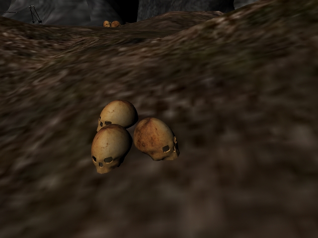
I wanted to add skull in the layout so I've started off with sketching the ideas so that I could use it as a reference. I've decided to not model the jaw bone to show that the skull has been there for many years. It will be added onto the layout.
Sunday, 28 October 2012
Second year - Fire again
Fire modelling take 2. Now it looks more like fire but very very thin. Almost looks like its burning from the candle or something. It's not really an 'Hell fire' as I am looking for more agressive burning.
But getting there, much better than last time.
Second year - Working on Fire
I wanted to add fluid effects of fire on the setting to represent the Hell theme... so far, not so good.
I have used fluid effects to make fire but the adjustment of the setting is so complicated.
It may look fine on the screen but when I render it doesn't look like fire...
It almost looks like liquid, not fire. The setting must be wrong...
I have used fluid effects to make fire but the adjustment of the setting is so complicated.
It may look fine on the screen but when I render it doesn't look like fire...
It almost looks like liquid, not fire. The setting must be wrong...
Wednesday, 24 October 2012
Second year - Texturing
I've added textures onto my layout to get the brief idea of what it would look like.
... At the moment it doesn't look like Hell at all, I will need background image (such as red sky) and more props (possibly weapons?)
Also I want to model fire as well, so I will be working onto this next.
... At the moment it doesn't look like Hell at all, I will need background image (such as red sky) and more props (possibly weapons?)
Also I want to model fire as well, so I will be working onto this next.
Friday, 12 October 2012
Second year - Changes
Had another chat with my tutor and I have decided to cancel the idea of the heaven completely, so the story will finish with Norman flying up into the air.
It is a bit shame to take out the scenes that I was working on, but from this changes the process will be much easier and from now I only need to concentrate on the layout of the Hell. I can spend more time on props and backgrounds and possibly add more scenes to make the animation last longer.
Thursday, 11 October 2012
Second year - More advice!
Had a chat with my tutor again to get more ideas and whether I am actually 'on the track' with everything. Thankfully I am not behind, (not ahead, but better than behind) and the idea that I am going for is acceptable for this project. However there are quite a few tweeks that I need to make to improve my work even better.
The first point is the layout size. To make sure the camera woun't caught any 'ends' of the layout I need to make the layout at least 3 times bigger than the area that I will be filming so that my camera can come in at any angle. Also for the Hell layout I should think about the sizes more because the more scenes will be filmed in the Hell.
The second, and the major point is the Heaven. Just because the Heaven will only appear for a few seconds its also very important settings since it concludes the story.
The size of the layout will also has to be bigger than the area that I will be filming, same as Hell. But since the layout is going to be at the Heaven I wanted to model the clouds so that it brings more of the Heaven taste. But here's some problem. Modelling clouds will be easy but it would not look realistic at all. As I have done a bit of practise earlier it just looks too solid and it almost looks like something else. I also tryed fluid tool to get more realistic texture but these are for backgrounds which does not includes interaction. Fluid tool lets me create the exact texture that I am going for, but it doesn't let me to interact with other object. I want Norman to bounce onto the cloud but with the fluid tool I cannot do that.
One of my friend has given me a good advice of using both of the tools to get the exact actions that I am going for. He reccomended me to model a few cloud (not with fluid tool, actually modelling) and cover them up with the cloud that I created with fluid tool. So that it creates the illusion of Norman bouncing on the cloud that actually looks realistic rather than the horrible solid cloud.
Third one is the background. Even the layout modelling went well if the background is plain then it ruins everything. So I've learned how to use Alpha on Photoshop so that it would be useful. I will be working on the background later to practise the Alpha.
So... I am left with billions of work to do, so it should keep me busy for while!
The first point is the layout size. To make sure the camera woun't caught any 'ends' of the layout I need to make the layout at least 3 times bigger than the area that I will be filming so that my camera can come in at any angle. Also for the Hell layout I should think about the sizes more because the more scenes will be filmed in the Hell.
The second, and the major point is the Heaven. Just because the Heaven will only appear for a few seconds its also very important settings since it concludes the story.
The size of the layout will also has to be bigger than the area that I will be filming, same as Hell. But since the layout is going to be at the Heaven I wanted to model the clouds so that it brings more of the Heaven taste. But here's some problem. Modelling clouds will be easy but it would not look realistic at all. As I have done a bit of practise earlier it just looks too solid and it almost looks like something else. I also tryed fluid tool to get more realistic texture but these are for backgrounds which does not includes interaction. Fluid tool lets me create the exact texture that I am going for, but it doesn't let me to interact with other object. I want Norman to bounce onto the cloud but with the fluid tool I cannot do that.
One of my friend has given me a good advice of using both of the tools to get the exact actions that I am going for. He reccomended me to model a few cloud (not with fluid tool, actually modelling) and cover them up with the cloud that I created with fluid tool. So that it creates the illusion of Norman bouncing on the cloud that actually looks realistic rather than the horrible solid cloud.
Third one is the background. Even the layout modelling went well if the background is plain then it ruins everything. So I've learned how to use Alpha on Photoshop so that it would be useful. I will be working on the background later to practise the Alpha.
So... I am left with billions of work to do, so it should keep me busy for while!
Wednesday, 10 October 2012
Second year - Layout again and again...
I have been very ill for past few days and I am regretting myself that I should've pushed myself to do some work, so since I am getting tiny bit better right now I am forcing myself to work (pretending to slap myself with a giant whip) since I can't make an illness as an excuse to not work.
Anyway, enough with me talking random stuff, I have got the full ideas of my both layout.
Hell is going to be a full of mountains with a prop such as burnt trees, weapons etc. It will also have the scary-looking cave/building with evil face. This building would not be interacted with Norman.
I also did the heaven sketch, heaven will be very simple since it will only appear for a few seconds. but I want to make a gate which I got the inspiration from the research. I want to create the curly (?) patterns on the gate. I will be working on them on Maya next.
Anyway, enough with me talking random stuff, I have got the full ideas of my both layout.
Hell is going to be a full of mountains with a prop such as burnt trees, weapons etc. It will also have the scary-looking cave/building with evil face. This building would not be interacted with Norman. I also did the heaven sketch, heaven will be very simple since it will only appear for a few seconds. but I want to make a gate which I got the inspiration from the research. I want to create the curly (?) patterns on the gate. I will be working on them on Maya next.
Monday, 8 October 2012
Second year - Maya layout
Trying to model a simple layout on Hell. This is just a practise just to get some ideas of what I could do to this.
I will be adding more props onto this, but for the initial ideas I have placed the swing on the left hand side. Norman will enter from the right hand side (walking straight line towards to the swing.

I also wanted to build some kind of a castle/cave looking object in the background (Normal woun't be interacting with this building)
I wanted to create the scary-looking face onto the building so I have used Interactive split tool to
create the eyes and the spikey teeth-looking entrance.
I will be adding more props onto this, but for the initial ideas I have placed the swing on the left hand side. Norman will enter from the right hand side (walking straight line towards to the swing.

I also wanted to build some kind of a castle/cave looking object in the background (Normal woun't be interacting with this building)
I wanted to create the scary-looking face onto the building so I have used Interactive split tool to
create the eyes and the spikey teeth-looking entrance.
Friday, 5 October 2012
Second year - Layout design again
I've done another layout design for Hell, I wanted to represent the 'hell' theme so I added a scary-looking cave in the background. The character will not be interacted with any of the object in the layout but it will be there to show the hell-theme.
Wednesday, 3 October 2012
Second year - More ideas...
I had another chat with my tutor and he gave me more advices to improve my work.
1. Since I have 2 layouts I must keep it as simple as possible.
I have chosen Heaven and Hell for my layout, and because these two locations are complicated I must keep it as simple as possible. So no complicated buildings or too much detailed layout.
2. Decorations?
I know I have mentioned above about keeping things simple, but too simple is no good! E.g. If I keep my layout of the hell too simple it will just be like a wasteland with random fire burning around, which is boring. I need to think about what I could add for the decorations to represent that 'My layout is at the Hell'. So maybe I could add a burnt tree in the background, or cave made up with skeleton... maybe too much detail, but to get more ideas I do need to do more research.
3. Colour Scheme
To represent the definite location (as in when people look at my work they will immediately think the location is set in Heaven/Hell) I need to have the colour scheme. For example, I can't have a bright blue sky with sunshine in Hell, or dark red sky with burnt ground isn't a Heaven.
These 3 points are my next task which I will be working on and hopefully I could reach my target and achieve all 3 points to improve my work.
1. Since I have 2 layouts I must keep it as simple as possible.
I have chosen Heaven and Hell for my layout, and because these two locations are complicated I must keep it as simple as possible. So no complicated buildings or too much detailed layout.
2. Decorations?
I know I have mentioned above about keeping things simple, but too simple is no good! E.g. If I keep my layout of the hell too simple it will just be like a wasteland with random fire burning around, which is boring. I need to think about what I could add for the decorations to represent that 'My layout is at the Hell'. So maybe I could add a burnt tree in the background, or cave made up with skeleton... maybe too much detail, but to get more ideas I do need to do more research.
3. Colour Scheme
To represent the definite location (as in when people look at my work they will immediately think the location is set in Heaven/Hell) I need to have the colour scheme. For example, I can't have a bright blue sky with sunshine in Hell, or dark red sky with burnt ground isn't a Heaven.
These 3 points are my next task which I will be working on and hopefully I could reach my target and achieve all 3 points to improve my work.
Wednesday, 26 September 2012
Second year - Layout
When we first got mentioned that we need to think of a layout (or location) somehow I instantly thought of a children's playground.
So I started some research of the equipment that we see in children's playground I thought the swings will make an interesting equipment to animate with character (norman).
I started from drawing the swings and from the research I was amazed there are a lot of types of swings. Personally I have only seen the standard style which I have drawn on the right.
Also there are different types of chain as well. I personally like the rope handle because it is the most safest one (I think?) I had a bad experience of getting my hand skin stuck in between the metal chains when I was young.
Also the chain with a long bar in between is what I see the most in many playground.
So I started some research of the equipment that we see in children's playground I thought the swings will make an interesting equipment to animate with character (norman).
I started from drawing the swings and from the research I was amazed there are a lot of types of swings. Personally I have only seen the standard style which I have drawn on the right.
Also there are different types of chain as well. I personally like the rope handle because it is the most safest one (I think?) I had a bad experience of getting my hand skin stuck in between the metal chains when I was young.
Also the chain with a long bar in between is what I see the most in many playground.
Tuesday, 6 December 2011
Layout (Initial)

I was ill and managed to miss the lecture on layouts, so I did not know where to start!! Since I was ill and in bed for most of the first 2 weeks of University I have decided to do a sketch from the view from my bedroom window. The first image is from my sketchbook, I have scanned into my laptop and slightly coloured in with photoshop. These are just an experiment of what I could do and getting some ideas by looking at places or landscape etc. After I got better and returned to Uni I have explored around the University and around my house to get more ideas into my head. At the moment my head is about to explode from all the catching up and everything!! I feel like I am making an excuse but I was very struggling to start off with this layouts.
Subscribe to:
Posts (Atom)